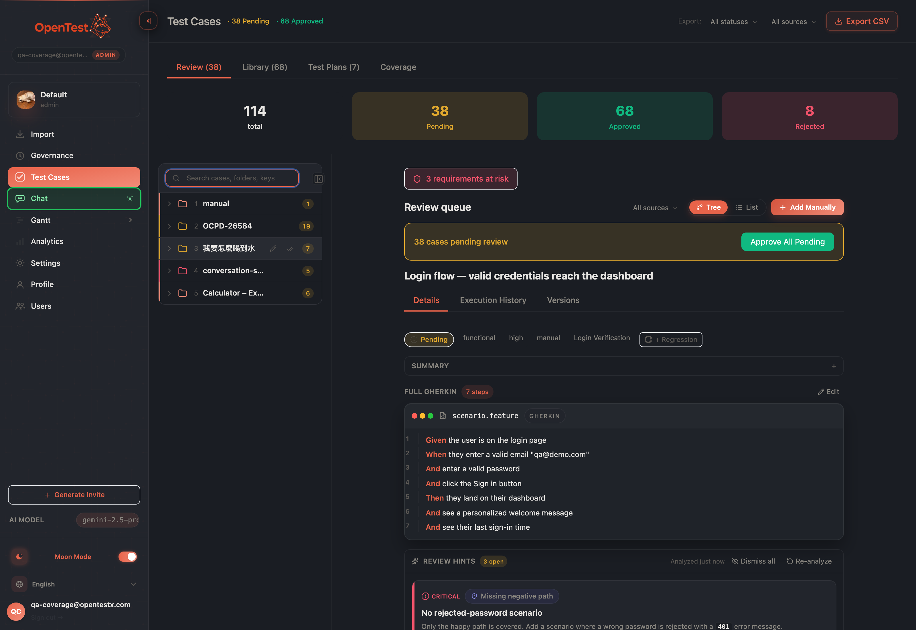
Reviewing dozens of pending cases without losing your place
Approving AI-generated test cases used to mean a modal that opened, then closed, then dropped you back at the top of the list. We rebuilt review as a persistent three-zone workspace where context never resets.
When the AI generates a batch of test cases, a human still approves them. That is the point — the model proposes, a QA lead decides. But the deciding part had a quiet tax we had stopped noticing: every case opened in a centered modal, and every close dropped you back at the top of the list, hunting for where you were.
One workspace, three zones: resizable tree, master list, center detail. Selecting a case never closes anything.
Reviewing 38 pending cases that way is 38 small acts of getting lost. The modal was a context grenade — it took over the screen, and closing it threw away everything around the thing you were reading. So we stopped opening and closing things. Review is now a persistent three-zone workspace: a folder tree, a master list, and a center detail pane that are all on screen at once.
Single click drives the center, not a popup
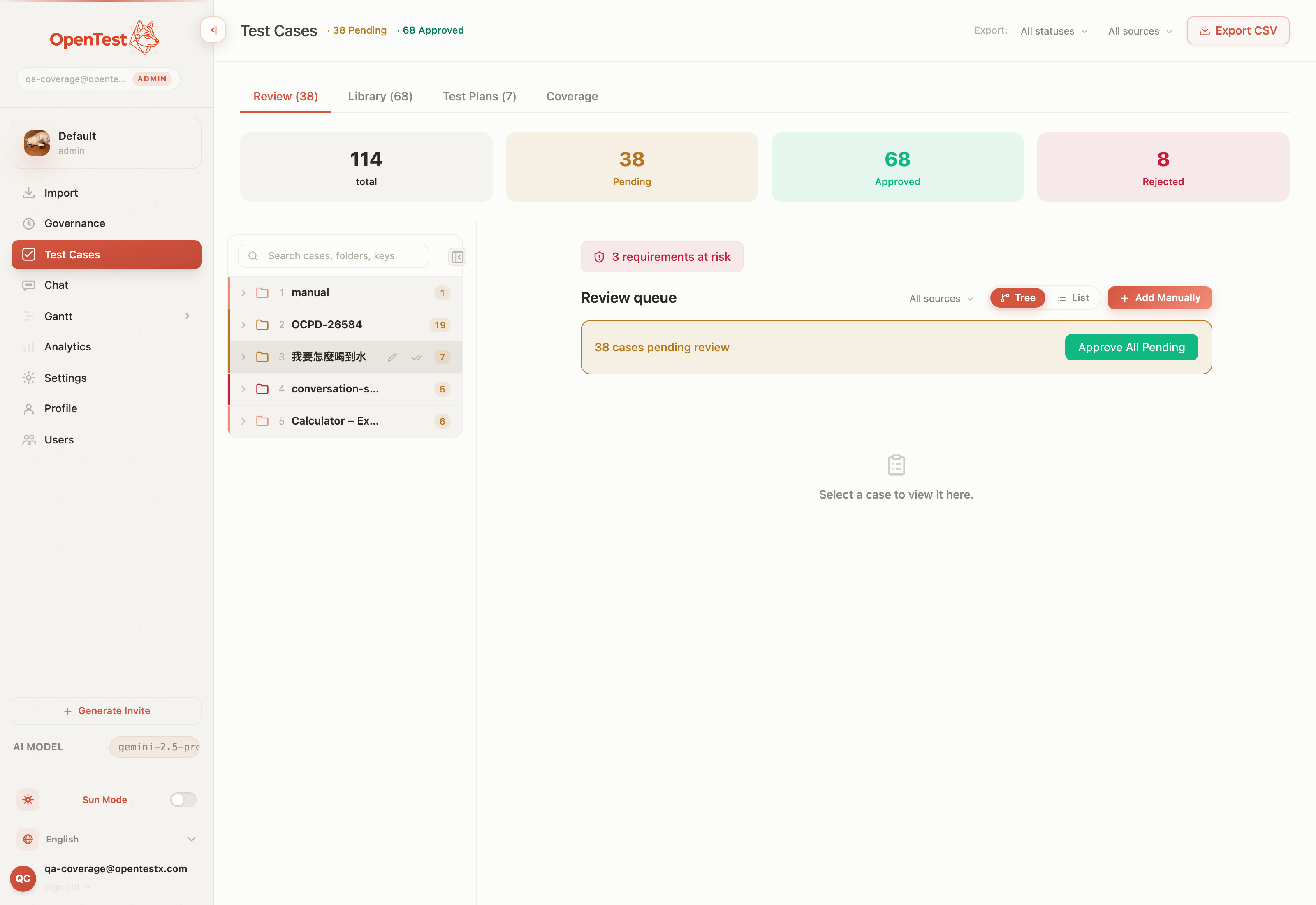
Click a case in the list and its full detail renders in the center pane — the tree and list stay exactly where they were. The list is the master; the center is the detail. There is no modal to dismiss, so there is no place to lose. The same model holds whether you came in from the tree or scrolled the flat list: one consistent surface, one selection.
Approve, and it advances for you
The real win is the rhythm. Approve or reject a pending case and the center auto-advances to the next pending case in the same folder. You are not steering a cursor back to a list and re-finding your spot — you read, you decide, the next decision is already in front of you. Clear the last one in a folder and the center shows a calm empty state instead of a dead end.
For the cases that don't need a per-case read, folder-level bulk approve clears an entire folder of pending cases in one action. (Under the hood it chunks large folders so a 600-case folder approves as cleanly as a 6-case one — you never see the seam.) The detail loop is for judgement; bulk approve is for the cases that already earned trust.
A tree you can actually live in
The left zone is a folder tree, and we treated it as a place you spend hours, not a nav afterthought. It is resizable — drag the divider to give the tree more room or hand it back to the detail. It has search to filter folders, per-folder colors so your eye learns the map, and rename via a display alias so a folder reads the way your team talks, not the way an importer named it.
Resizable divider — the tree and detail share the width on your terms, not a fixed split.
Search and per-folder color — find a folder fast, recognize it faster.
Display-alias rename — a friendly name on top of the real one, no data rewrite.
Collapse to a designed rail — not a blank gutter; a deliberate vertical rail you can re-open.
Collapse the tree and it doesn't just vanish into an awkward gap — it folds to a designed rail, and the content reclaims the freed width. When you are deep in a single folder's cases, you give the reading the whole screen; when you need the map back, one click restores it.
Light mode is a first-class citizen, not an afterthought — both themes ship the full layout.
Reviewed here, dragged onto a plan
Review is only useful if approved cases go somewhere. So the workspace closes the loop: drag a case from the Library tree, and a drop strip appears only while you are dragging — listing the plans this case is actually eligible for. No floating panel cluttering the screen when you are reading; it materializes for the gesture and disappears after.
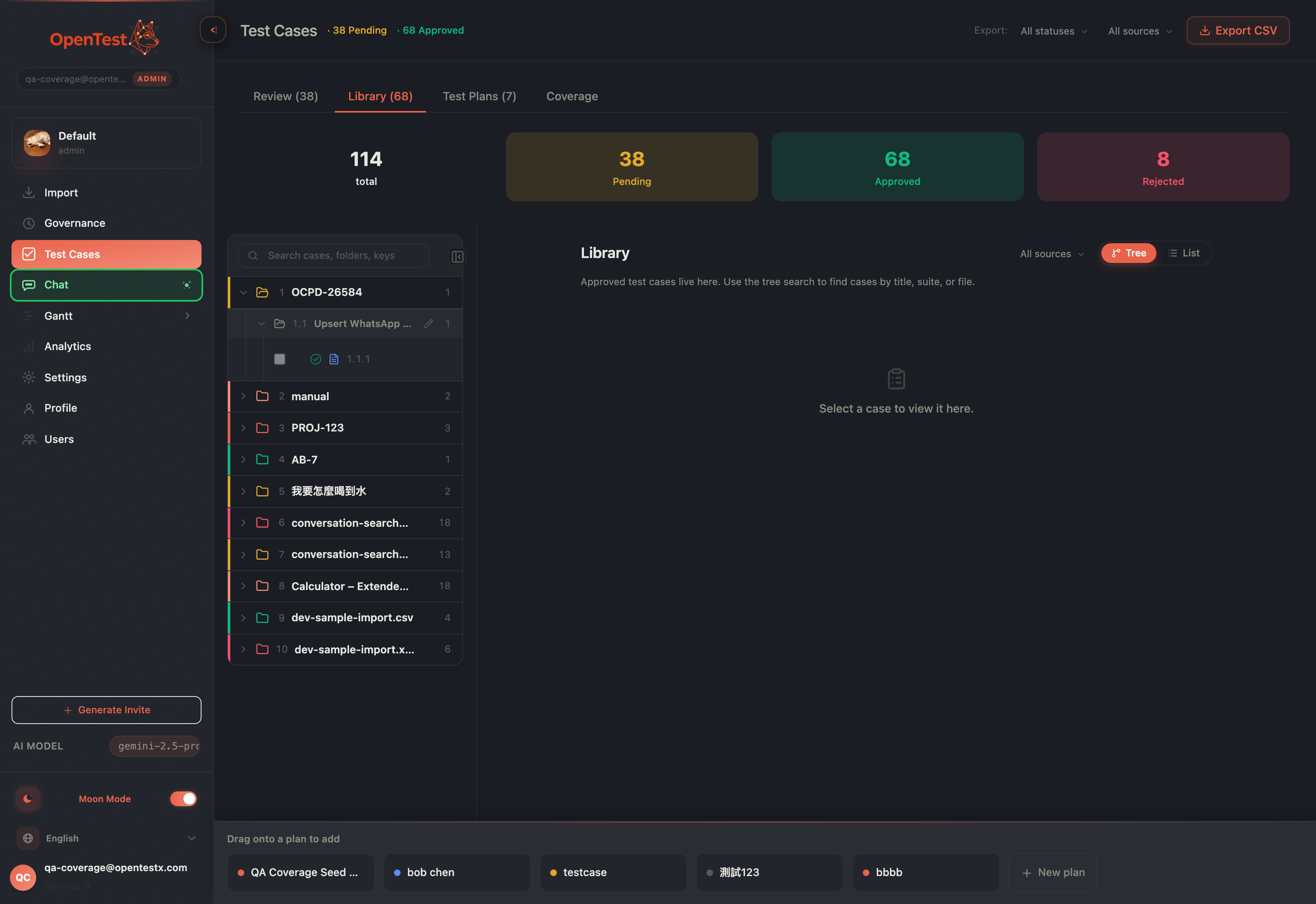
The drop strip surfaces only mid-drag, and only the eligible plans — drop a case straight onto a plan.
One honest note on scope. The drag-to-plan gesture is a desktop, mouse-driven path — for keyboard and touch, the case-picker modal remains the way in, and it is fully supported. The tree itself hides below the large breakpoint rather than reflowing into a phone-native layout; this workspace is built for the wide screen a reviewer actually works on. We would rather tell you exactly where the edges are than imply a mobile review flow we haven't shipped.
Why this is the AI-native part
When a model generates test cases at volume, the bottleneck moves to human judgement — and judgement is fragile when the tool keeps resetting your context. A persistent workspace, auto-advance, and bulk approve are not cosmetics; they are what let one reviewer keep pace with a generator that never tires. The faster a human can say yes, no, next without losing the thread, the more the AI's output is actually worth.
Curious how this looks inside your team?
Book a short consult and we will walk through how OpenTestX maps to your current QA system.
Book a consultation →Related posts
Our risk pill almost shipped a lie. Our own eval caught it.
We built a Gantt board that flags its own slipping groups and drafts a catch-up plan from your team's methodology. Then our own A/B eval told us the proof was rigged — so we fixed the product, not the test. The honest 5 → 1 → 5.
Our coral sat 9° from our error red. We fixed color by measuring, not feeling.
A user told us twice the colors were too similar. The first fix over-corrected — every category chip went gray, and uniform is not the same as clear. The second fix put a number on it: our brand coral lives at hue 9°, our error red at 0°. Nine degrees apart, same lightness. You don't argue with 9°. You move.
The governance flywheel: when recurring review findings write their own methodology rule
Every AI review finding already lands in a per-case worklist. But the patterns across cases were going unread. The flywheel reads them — and when a weakness has truly recurred, it proposes one grounded SKILL.md rule into the queue you already approve from. The SQL decides. The model only phrases. A human still signs.