Our coral sat 9° from our error red. We fixed color by measuring, not feeling.
A user told us twice the colors were too similar. The first fix over-corrected — every category chip went gray, and uniform is not the same as clear. The second fix put a number on it: our brand coral lives at hue 9°, our error red at 0°. Nine degrees apart, same lightness. You don't argue with 9°. You move.
Act one: the fix that made everything the same
A user told us the colors in our review panel were too similar. Fair. The row was shouting in coral — chips, links, dots, all warm. So we quieted it: neutral chips, a small severity dot, gray action links. The row stopped shouting.
Then the same user said it again: still not enough discriminability. And they were right, because we had solved the wrong problem. We'd attacked noise when the real failure was signal. By neutralizing everything, we'd flattened eight distinct hint categories — missing edge case, ambiguous step, traceability gap — into eight identical gray chips. The only thing telling them apart was an 11-pixel icon.
The over-correction. Quieting the noise flattened the signal — four categories, four indistinguishable gray pills. Uniform is not the same as clear.
That is the lesson of act one, and it is worth saying plainly: uniform is not the same as clear. Making things the same is the easiest way to look tidy and the fastest way to destroy the distinctions a reader actually needs.
Act two: put a number on the feeling
“Too similar” is a feeling, and you cannot fix a feeling by feeling harder at it. So we stopped designing and started measuring. We pulled the computed values straight off the running build and converted every semantic color to HSL. The hue wheel told the whole story in one line.
Our brand coral measured #D4553F at hue 9°. Our error red measured #ef4444 at hue 0°. Nine degrees apart, at nearly the same lightness. The brand is a warm red — which meant “critical” had almost nowhere to live. On screen, the reject button, the today-line, the export button, and a critical severity rail were all the same warm signal to a glance.
The warning amber sat in the same warm band, 38° away — close enough that, shrunk to a six-pixel dot, amber and red were nearly the same mark. Severity — the single most important sort key in the panel — was riding on the two smallest pixels in the row. That is the measurement that ended the argument. You don't debate 9°. You move the colors.
Act three: evacuate the brand's neighborhood
The fix follows one rule: the warm band belongs to the brand, and nothing else. The coral never moves — it is the product. Everything semantic evacuates out of its neighborhood:
Error → crimson. From
#ef4444to a deeper blue-red (#C81E3Alight,#F2536Bdark) that reads as STOP, not as the brand.Warning → gold. Pulled out of the orange family toward true gold, so caution stops looking like another warm thing.
Info → blue. Opened away from the cool teal smear where success, freedom, and info were collapsing into one.
Coral → untouched. Brand fidelity is the hard constraint. We move the semantics, never the brand.
And while we were in the palette, we killed 14 hardcoded hex duplicates scattered through components — the only way to guarantee no “second red” quietly ships behind the token sheet. One source of truth, or you have not actually fixed anything.
Severity in four channels, because color is never enough
A nine-degree miss between amber and red is also a colorblind hazard. So severity no longer rides on hue at all. It is encoded in four redundant channels at once: shape (octagon, triangle, circle), size (14, 12, 11 pixels), an edge bar that thickens with severity, and a text label. The list now sorts critical-first, so the worst issue is at the top before you read a single word. A protan or deutan reader gets the tier from the shape alone.
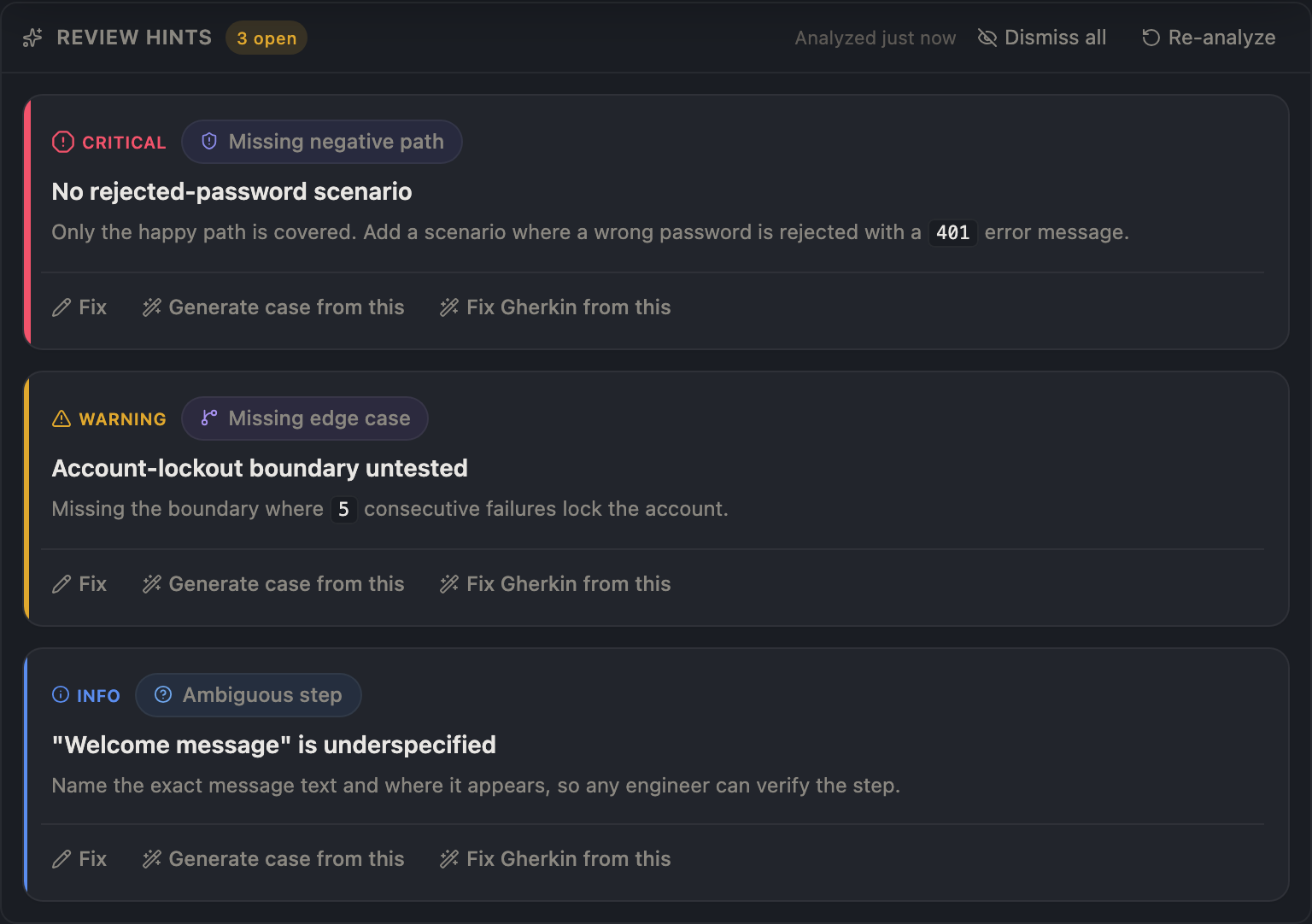
After, dark: severity reads in four redundant channels; the eight categories return as a disciplined cool-register ramp that can never collide with the warm brand band.
The eight categories got their color back — but in a cool register, hues from 180° to 300°, every one of them more than 170° from the brand coral. They are physically incapable of colliding with the warm band. Category becomes scannable again; severity stays the loudest signal; nothing competes.
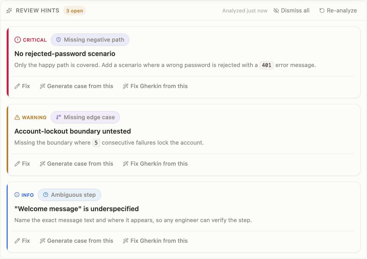
After, light: the same system holds on the light canvas — eight distinct cool tints, severity unmistakable.
Seen at page scale, the whole palette resolves into one coherent product where each color carries exactly one meaning: coral is the action you take, crimson is stop, gold is caution, blue is info, and the cool ramp is just for grouping.
The palette at page scale: coral for action, semantics evacuated to their own hue zones, categories in cool. One product, one meaning per color.
Honest scope
This is our design journey, not a universal prescription — your brand sits somewhere else on the wheel and your collisions will differ. And one honest footnote: the light-mode gold clears AA for large text but not for small text on the bare canvas. We measured it, we accepted it, and we documented it rather than pretend it away. That is the whole point of this post: measure the thing, then decide with your eyes open — not by feeling, and not by pretending the number says something it doesn't.
Curious how this looks inside your team?
Book a short consult and we will walk through how OpenTestX maps to your current QA system.
Book a consultation →Related posts
Our risk pill almost shipped a lie. Our own eval caught it.
We built a Gantt board that flags its own slipping groups and drafts a catch-up plan from your team's methodology. Then our own A/B eval told us the proof was rigged — so we fixed the product, not the test. The honest 5 → 1 → 5.
The governance flywheel: when recurring review findings write their own methodology rule
Every AI review finding already lands in a per-case worklist. But the patterns across cases were going unread. The flywheel reads them — and when a weakness has truly recurred, it proposes one grounded SKILL.md rule into the queue you already approve from. The SQL decides. The model only phrases. A human still signs.
Drop a case onto a plan — the target appears only while you drag
Grab a test case from the Library tree, drag it down, and a drop strip materializes at the bottom of the screen — listing only the plans that can actually accept the case. Zero idle pixels, no closed ledgers reopened by accident.